 Helly Hansen Logo
The Helly Hansen logo demonstrates a non-standard approach to cutting and models. The brand produces stylish and comfortable sportswear suitable for active people. The emblem hints at the readiness of models for extreme tests.
| Founded: | 1877 |
| Founder: | Helly Juell Hansen |
| Headquarters: |
Oslo, Norway |
| Website: | hellyhansen.com |

What is Helly Hansen?
Helly Hansen is a Norwegian company also known as HH. It manufactures sports and outdoor clothing, fishing equipment, rescue equipment. Special technologies make things warm and waterproof.
The original design label of the company has adorned branded products almost since its inception. It has a clear link to the owner, so the logo uses two capital letters of his first and last name.
In 1914, after the founder’s death, the brand underwent a serious rebranding, which did not affect the trademark. The new owner –Levy Helly Hansen –is the successor of his father’s business and has the same initials in his full name. Therefore, they decided to leave the combination of the two words, as they are strongly associated with the company.
As conceived by the designers, such a logo is simple, inspiring confidence among buyers of all social strata and ages. It instills confidence in the highest quality, reliability, and durability, which is very important for those associated with extreme sports and being in difficult conditions.
At the moment, during this period of the company’s development, the brand’s logo and emblem are unknown.
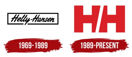
1969 –1989
The Helly Hansen logo consisted of the name in one line. It was written in cursive calligraphy, imitating individual handwriting. Between the two parts was a hyphen of the same black color as the entire inscription. The letters were stretched upwards, so they seemed thin. This impression was also created due to the elongated tail “y,” which went beyond the lower border. A bold rectangular box framed the text.
1989 –today
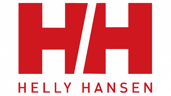
Now a modernized Helly Hansen emblem is used, consisting of an abbreviation. The letters “HH” are combined in a special way: the right and left sides are crossed by a diagonal line in negative space. It cuts off the stem of each glyph (top and bottom), making the character well-recognizable. In addition, the slanted strip brings dynamics to it and evokes a feeling of confidence and strength. Signs are large, blocky, and smooth, without serifs. The angles at the level transitions are precise and even. The monotonous black color has also disappeared: now, the inscription is painted in red, close to a burgundy hue.
Font and Colors
The label consists of a title in two forms –full and abbreviated. The name and its abbreviation are colored white and enclosed in a bright red rectangle. This palette reflects the emotionality, energy, dynamism, and strength inherent in buyers’ target group.

A thin line dividing the central HH diagonally also conveys dynamics. This design trick is used for a powerful visual identity. All words are capitalized in bold sans serif type. They are graphically designed with sharp angles that emphasize pressure and stability.

| Pigment Red | Hex color: | #e32b2b |
|---|---|---|
| RGB: | 227 43 43 | |
| CMYK: | 0 81 81 11 | |
| Pantone: | PMS Bright Red C |
The Helly Hansen logo consists of two white ‘H’s’ separated by an oblique red line. Where the diagonal runs, the sides of the letters are deformed. The full name of the company is written at the bottom. All elements are based on a red rectangle.
Helly Hansen was named after a real person – a sea captain, who, together with his wife, began to sew clothes for long voyages. At first, entrepreneurs worked in the basement of their homes, and then they had a whole network of factories.
Helly Hansen offers clothing for a variety of sports, including snowboarding.
HH garments are made from hydrophilic and microporous materials, which are created using a special technology. This helps wick away excess moisture and increases the comfort level when wearing branded items.

总监微信咨询 舒先生

业务咨询 付小姐

业务咨询 张小姐