 I Love New York Logo
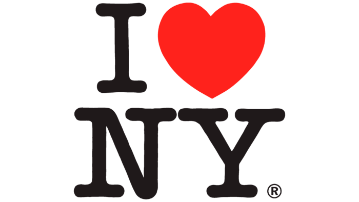
The I Love New York logo is the embodiment of this phrase, and the designers designed it in an interesting way to make it look like a puzzle. The original logo includes fervent love, recognition, and patriotism. It became so famous that similar signs were dedicated to other cities after it began to appear.
| Founded: | July 15, 1977 |
| Founder: | NY Department of Economic Development |
| Headquarters: |
United States |
| Website: | iloveny.com |

The icon has become so popular that it can be seen everywhere: on advertising posters, brochures, brochures, mugs, flags, T-shirts, baseball caps, and numerous other assorted souvenir items. In addition, the logo exists in the form of large and small installations scattered throughout the state of New York. It has developed a huge army of followers, so similar emblems (but with different names of administrative offices) can be seen in every corner of the world.
And it all started with an action organized by the regional Department of Commerce. It was announced by William S. Doyle, hiring marketing agency Wells Rich Greene. Graphic artist Milton Glaser was also involved in the process. The initial sketch came about spontaneously –during a cab ride. The author assumed it was a short-term campaign for a couple of months, so he did the work pro bono. But the innovative badge became so beloved that it became an independent brand and an inseparable symbol of the city of New York. And the conceptual sketch and presentation materials were given to the Museum of Modern Art, where they are still kept to this day.

The second surge of popularity of the icon with a declaration of love for New York occurred after the tragic events of September 11, 2001. Then in solidarity with the victims, Americans started buying and wearing clothes with the I Love New York logo to show their support. Glaser slightly modified the logo at that time, having drawn a small black spot on the red heart –a symbol of grief. It corresponded to the cartographic location of the demolished mall in the lower Manhattan Island area. The emblem was placed on a poster and printed in the Daily News, a local newspaper that raised funds to support victims of the attacks.
The emblem consists of a shortened inscription symbolizing affection for the city and evoking a sense of unity among the metropolis residents. On the icon is the letter “I,” a red heart, as it is drawn on cupid cards, and the abbreviation “NY,” formed from the phrase “New York.” Originally, all the elements were on one line, but then they were split into two. Now each sign is proportionately placed above the other. The letters are bold, large, and decorated with large serifs that extend horizontally.
Font and Colors
The inscription on the logo is made in American Typewriter Medium –smooth and rounded on the protruding parts of the letters. Joel Kaden and Tony Stan designed it. It first appeared in ITC.
The official palette is understated, emphasizing the heart, which replaces the word “love.” It is the only one colored in bright red. The rest of the signs are black. The background is usually neutral –white.
I Love New York color codes| Neon Red | Hex color: | #ff221c |
|---|---|---|
| RGB: | 255 34 28 | |
| CMYK: | 0 87 89 | |
| Pantone: | PMS 172 C |
| Licorice | Hex color: | #1f191a |
|---|---|---|
| RGB: | 31 25 26 | |
| CMYK: | 0 19 16 88 | |
| Pantone: | PMS Neutral Black C |

总监微信咨询 舒先生

业务咨询 付小姐

业务咨询 张小姐